
The product wasn’t
clear upfront
Users moved quickly through onboarding. In interviews, they could not recall its content
mobile product · insurance · 2021–2022
Making on-demand car insurance
easier to understand and buy
The challenge
Simble let drivers buy car insurance for a chosen period, a set number of kilometers, or time spent parked. For drivers in Russia accustomed to annual comprehensive insurance (CASCO), that flexibility was unfamiliar.
Before they could decide whether the product was useful, they faced document uploads, vehicle photos, and insurance checks. They needed to understand the offer before investing that effort.
Users moved quickly through onboarding. In interviews, they could not recall its content
Users wanted to see how the product worked and what coverage might cost before uploading documents
Users described needing coverage for different situations: a specific trip, a limited period, or a car left parked
I was the sole product designer, responsible for research, UX, and UI. I conducted interviews independently and with the PM, reviewed user questions handled by support and social media teams, and tested prototypes through task-based sessions and informal usability checks. I worked with the PM to turn findings into design decisions and with engineers on implementation
demo mode
In interviews, users said they were reluctant to upload documents before understanding what the service offered them. Together with the PM, I used these findings to define a demo mode that would let users assess the offer before registering.
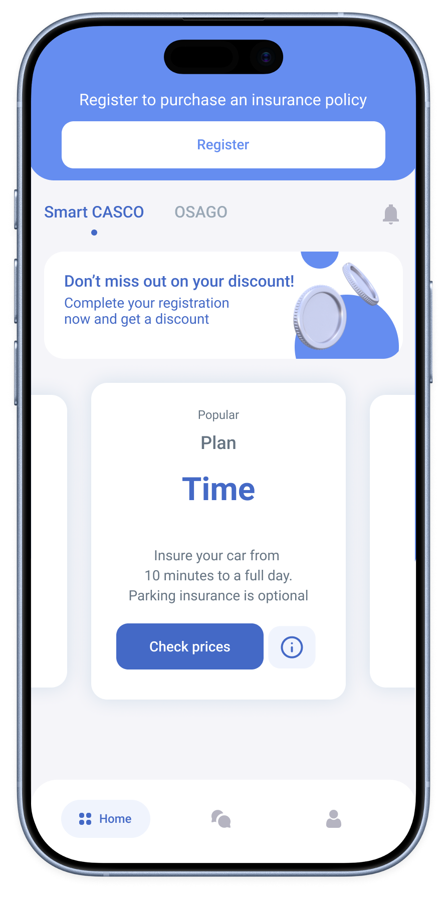
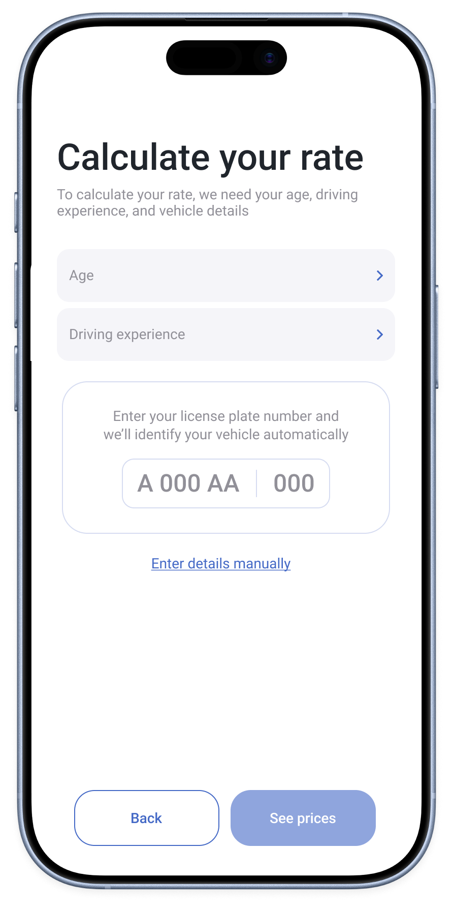
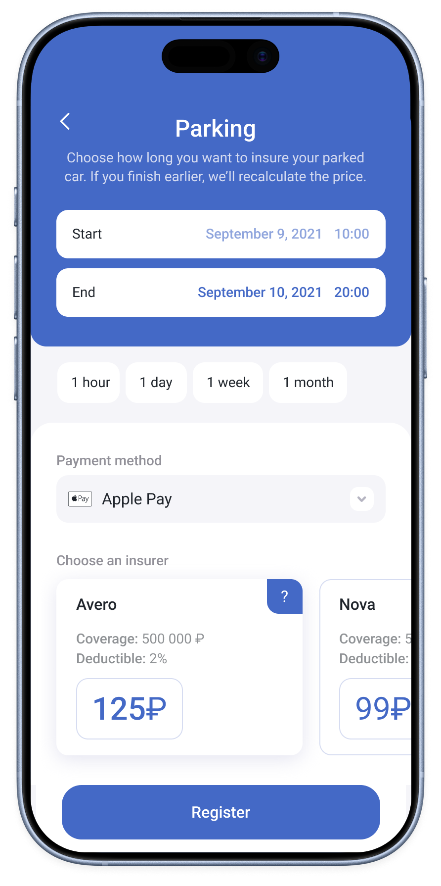
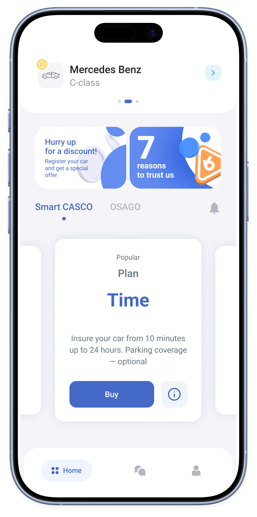
I designed a flow where users could browse plan descriptions, enter basic driver and vehicle details, then configure their chosen plan and see estimated prices from named insurers. Registration was required to purchase coverage.
registration — driver first/vehicle later
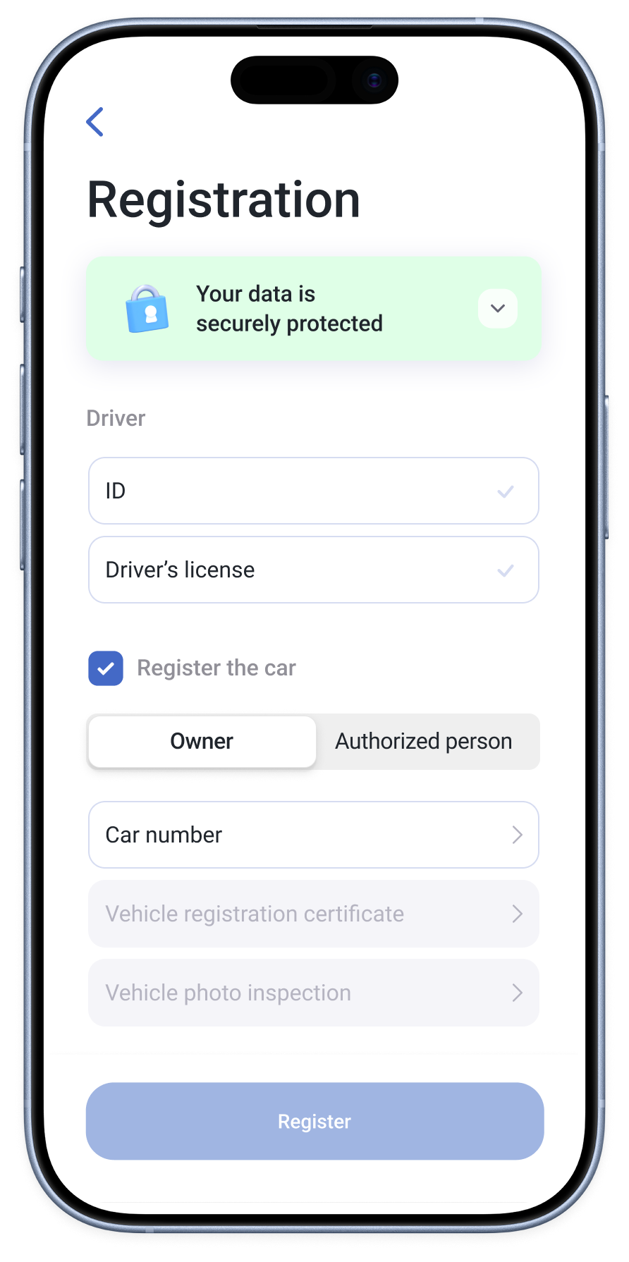
Before introducing demo mode, we had already begun making registration more flexible. Users told us they were not always ready to photograph their car when they downloaded the app. The insurer required photos in daylight and suitable weather, while users could have their personal documents ready at home.
I separated driver and vehicle registration so users could submit their documents for review without completing the vehicle inspection. They could add their car later through an “Add car” action on the home screen. Exact pricing still required complete driver and vehicle information.
Personal documents could be submitted without completing vehicle registration
Users could return to add vehicle details and photos
registration — saved progress
I broke vehicle registration into smaller steps and designed the flow so users could return after an interruption without starting over
Progress was saved so users could return to an unfinished vehicle registration without repeating completed stages
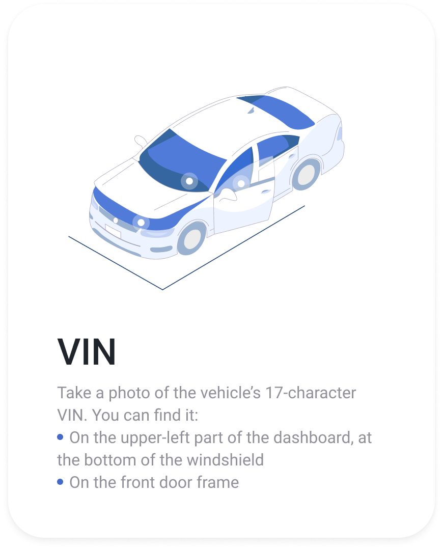
Support requests showed that users could not always find the VIN in the location illustrated. I expanded the guidance to show other possible locations.
match coverage to the situation
In interviews, users described wanting coverage while their car was parked, including in unfamiliar places or during bad weather. These needs informed the PM’s proposal for a dedicated Parking plan, with the format agreed with the insurer.
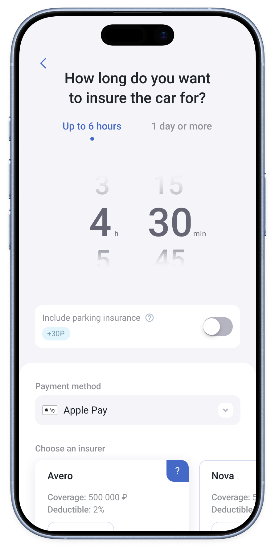
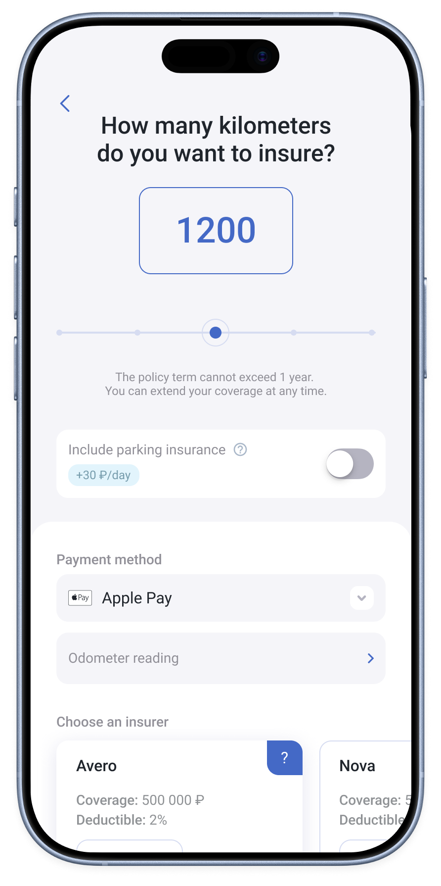
I designed the interface for the new plan and updated the visual design of the time picker and kilometer input in the existing Time and Kilometers plans.
Choose a start and end time for
parked-car coverage
Choose the duration
of coverage
Choose the number of kilometers
and provide an odometer reading
supporting the path to registration
Together with the PM, we decided to show more of the app’s functionality during onboarding. I replaced static illustrations with animated walkthroughs showing how the product worked, including its plans and available insurers. I designed and edited these videos.
I also designed the promo-code screen and home-screen banner for a time-limited registration incentive defined by the PM. The banner gave users access to the offer.
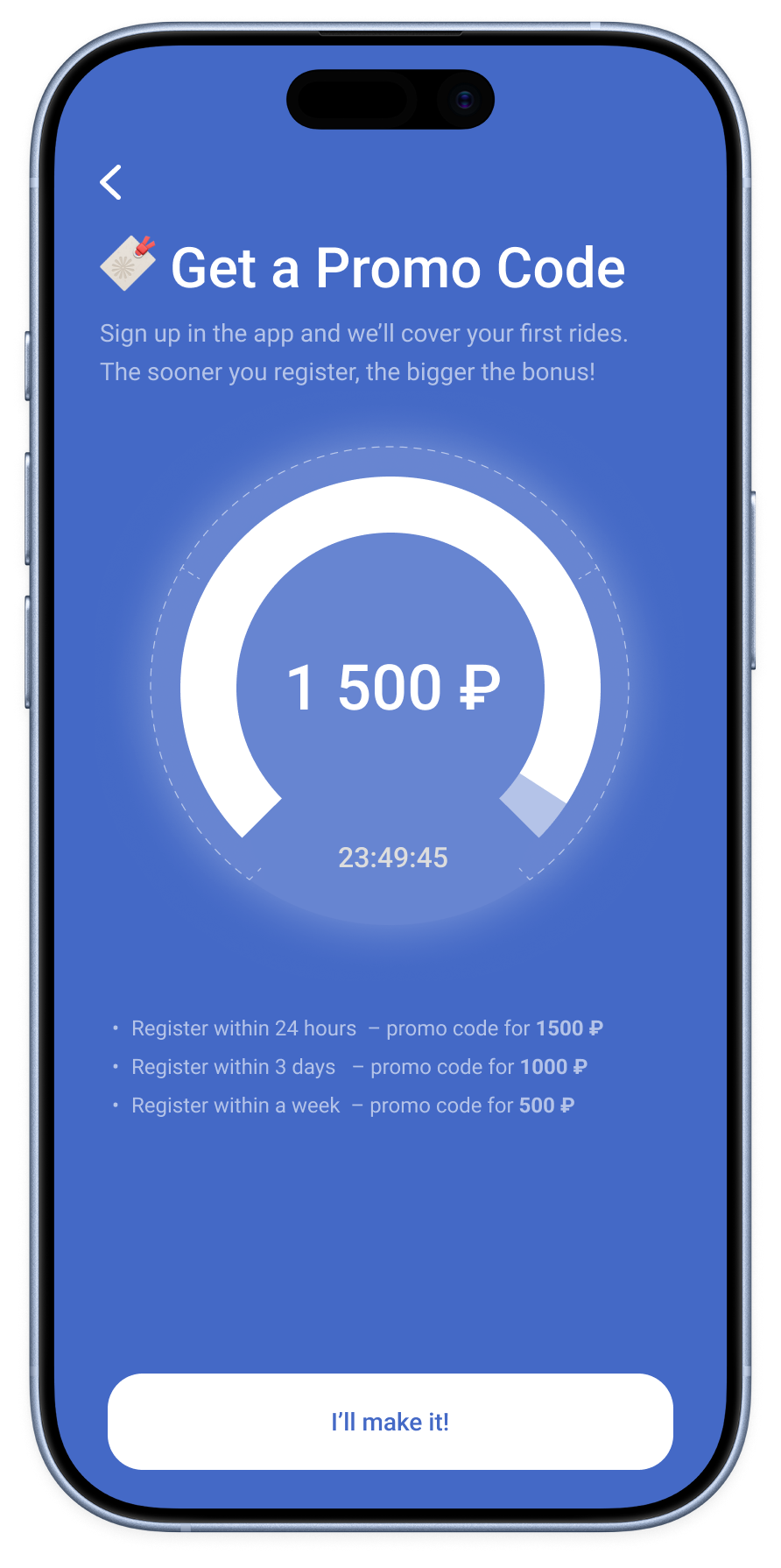
The PM reported that average time spent in onboarding increased from about 1 to 5.5 seconds, alongside an increase in registration conversion
Users could submit driver documents first, add their car later, and resume vehicle registration without repeating completed stages.
User interviews informed the PM’s proposal for a separate Parking plan. I designed its interface and visually updated the existing Time and Kilometers plans.
After demo mode launched, the PM reported fewer registration starts but an increase in the number of accounts registered per week.
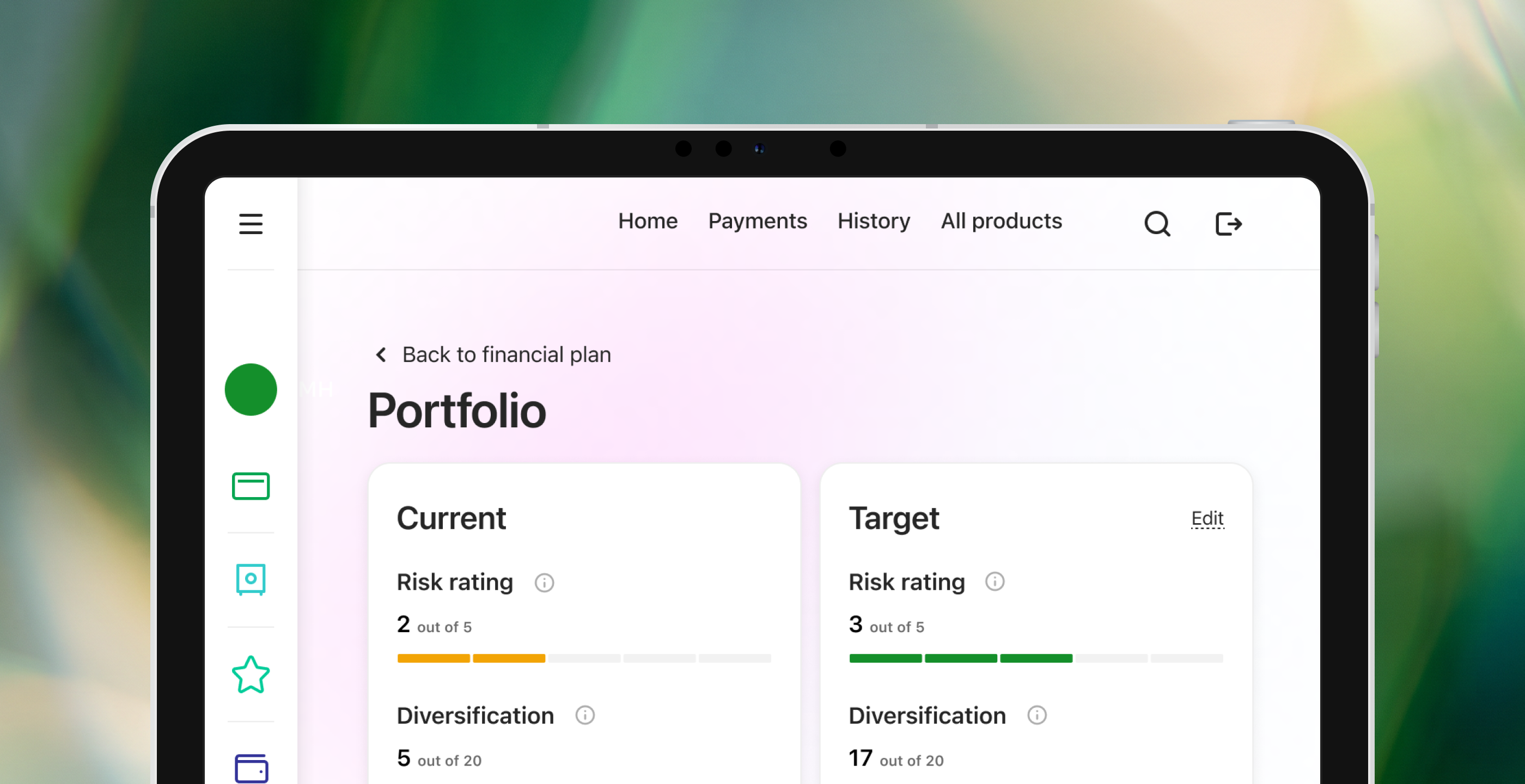
Designing investment tools for high-net-worth clients and their managers